


Pricing 37
Pricing2 ColumnsText Align LeftTabsPricing Section
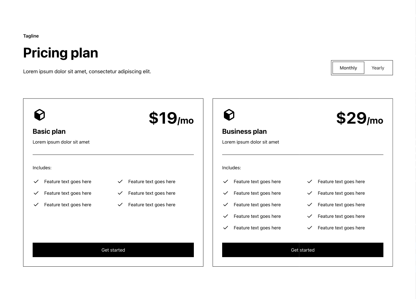
Code
relume-pricing37.tsx
import { Check, RelumeIcon } from "relume-icons";

import { Button, type ButtonProps } from "@/components/ui/button";
import { Card } from "@/components/ui/card";
import { Tabs, TabsContent, TabsList, TabsTrigger } from "@/components/ui/tabs";

type Billing = "monthly" | "yearly";

type PricingPlan = {
  planName: string;
  description: string;
  price: string;
  discount?: string;
  features: string[];
  button: ButtonProps;
};

type Tab = {
  value: Billing;
  tabName: string;
  plans: PricingPlan[];
};

type Props = {
  tagline: string;
  heading: string;
  description: string;
  defaultTabValue: Billing;
  tabs: Tab[];
};

export type Pricing37Props = React.ComponentPropsWithoutRef<"section"> & Partial<Props>;

export const Pricing37 = (props: Pricing37Props) => {
  const { tagline, heading, description, defaultTabValue, tabs } = {
    ...Pricing37Defaults,
    ...props,
  };
  return (
    <section className="px-[5%] py-16 md:py-24 lg:py-28">
      <div className="container">
        <Tabs defaultValue={defaultTabValue}>
          <div className="grid grid-cols-1 items-end justify-between lg:grid-cols-2 lg:gap-x-12">
            <div className="mb-12 max-w-lg md:mb-18 lg:mb-20">
              <p className="mb-3 font-semibold md:mb-4">{tagline}</p>
              <h1 className="mb-5 text-h2 font-bold md:mb-6">{heading}</h1>
              <p className="text-medium">{description}</p>
            </div>
            <TabsList className="mb-12 w-fit items-center rounded-button border bg-scheme-foreground p-1 group-data-[slot=card-flat]:border-transparent lg:mb-20 lg:justify-self-end">
              {tabs.map((tab, index) => (
                <TabsTrigger
                  key={index}
                  value={tab.value}
                  className="rounded-button data-[state=active]:bg-scheme-background data-[state=active]:font-medium data-[state=inactive]:bg-transparent"
                >
                  {tab.tabName}
                </TabsTrigger>
              ))}
            </TabsList>
          </div>
          {tabs.map((tab, index) => (
            <TabsContent key={index} value={tab.value} className="data-[state=active]:animate-tabs">
              <div className="grid grid-cols-1 gap-8 lg:grid-cols-2">
                {tab.plans.map((plan, planIndex) => (
                  <PricingPlan key={planIndex} plan={plan} billing={tab.value} />
                ))}
              </div>
            </TabsContent>
          ))}
        </Tabs>
      </div>
    </section>
  );
};

const PricingPlan = ({ plan, billing }: { plan: PricingPlan; billing: Billing }) => (
  <Card className="flex h-full flex-col justify-between px-6 py-8 md:p-8">
    <div>
      <div className="flex items-start justify-between">
        <div>
          <div className="mb-3 flex flex-col items-start justify-end md:mb-4">
            <RelumeIcon className="size-12 text-scheme-text" />
          </div>
          <h5 className="mb-2 text-h5 font-bold">{plan.planName}</h5>
          <p>{plan.description}</p>
        </div>
        <div className="text-right">
          <h1 className="text-h1 font-bold">
            {plan.price}
            <span className="inline text-h4 font-bold">
              {billing === "monthly" ? "/mo" : "/yr"}
            </span>
          </h1>
          {billing === "yearly" && plan.discount && (
            <p className="mt-2 font-medium">{plan.discount}</p>
          )}
        </div>
      </div>
      <div className="my-6 h-px w-full shrink-0 bg-scheme-border md:my-8" />
      <p className="mb-3 md:mb-4">Includes:</p>
      <div className="grid grid-cols-1 gap-x-6 gap-y-4 py-2 md:grid-cols-2">
        {plan.features.map((feature, index) => (
          <div key={index} className="flex self-start">
            <div className="mr-4 flex-none self-start">
              <Check className="size-6 text-scheme-text" />
            </div>
            <p>{feature}</p>
          </div>
        ))}
      </div>
    </div>
    <div className="mt-6 md:mt-8">
      <Button {...plan.button} className="w-full">
        {plan.button.title}
      </Button>
    </div>
  </Card>
);

export const Pricing37Defaults: Props = {
  tagline: "Tagline",
  heading: "Pricing plan",
  description: "Lorem ipsum dolor sit amet, consectetur adipiscing elit.",
  defaultTabValue: "monthly",
  tabs: [
    {
      value: "monthly",
      tabName: "Monthly",
      plans: [
        {
          planName: "Basic plan",
          description: "Lorem ipsum dolor sit amet",
          price: "$19",
          features: [
            "Feature text goes here",
            "Feature text goes here",
            "Feature text goes here",
            "Feature text goes here",
            "Feature text goes here",
            "Feature text goes here",
          ],
          button: { title: "Get started" },
        },
        {
          planName: "Business plan",
          description: "Lorem ipsum dolor sit amet",
          price: "$29",
          features: [
            "Feature text goes here",
            "Feature text goes here",
            "Feature text goes here",
            "Feature text goes here",
            "Feature text goes here",
            "Feature text goes here",
            "Feature text goes here",
            "Feature text goes here",
            "Feature text goes here",
            "Feature text goes here",
          ],
          button: { title: "Get started" },
        },
      ],
    },
    {
      value: "yearly",
      tabName: "Yearly",
      plans: [
        {
          planName: "Basic plan",
          description: "Lorem ipsum dolor sit amet",
          price: "$180",
          discount: "Save 20%",
          features: [
            "Feature text goes here",
            "Feature text goes here",
            "Feature text goes here",
            "Feature text goes here",
            "Feature text goes here",
            "Feature text goes here",
          ],
          button: { title: "Get started" },
        },
        {
          planName: "Business plan",
          description: "Lorem ipsum dolor sit amet",
          price: "$280",
          discount: "Save 20%",
          features: [
            "Feature text goes here",
            "Feature text goes here",
            "Feature text goes here",
            "Feature text goes here",
            "Feature text goes here",
            "Feature text goes here",
            "Feature text goes here",
            "Feature text goes here",
            "Feature text goes here",
            "Feature text goes here",
          ],
          button: { title: "Get started" },
        },
      ],
    },
  ],
};
npm i @radix-ui/react-slot @radix-ui/react-tabs class-variance-authority@0.7.1 clsx@^2.1.1 relume-icons@1.3.0 tailwind-merge@^2.2.2