


Layout 518
cardText Align Center2 ColumnsImage/Video LeftButtonsMultiple ImagesCards
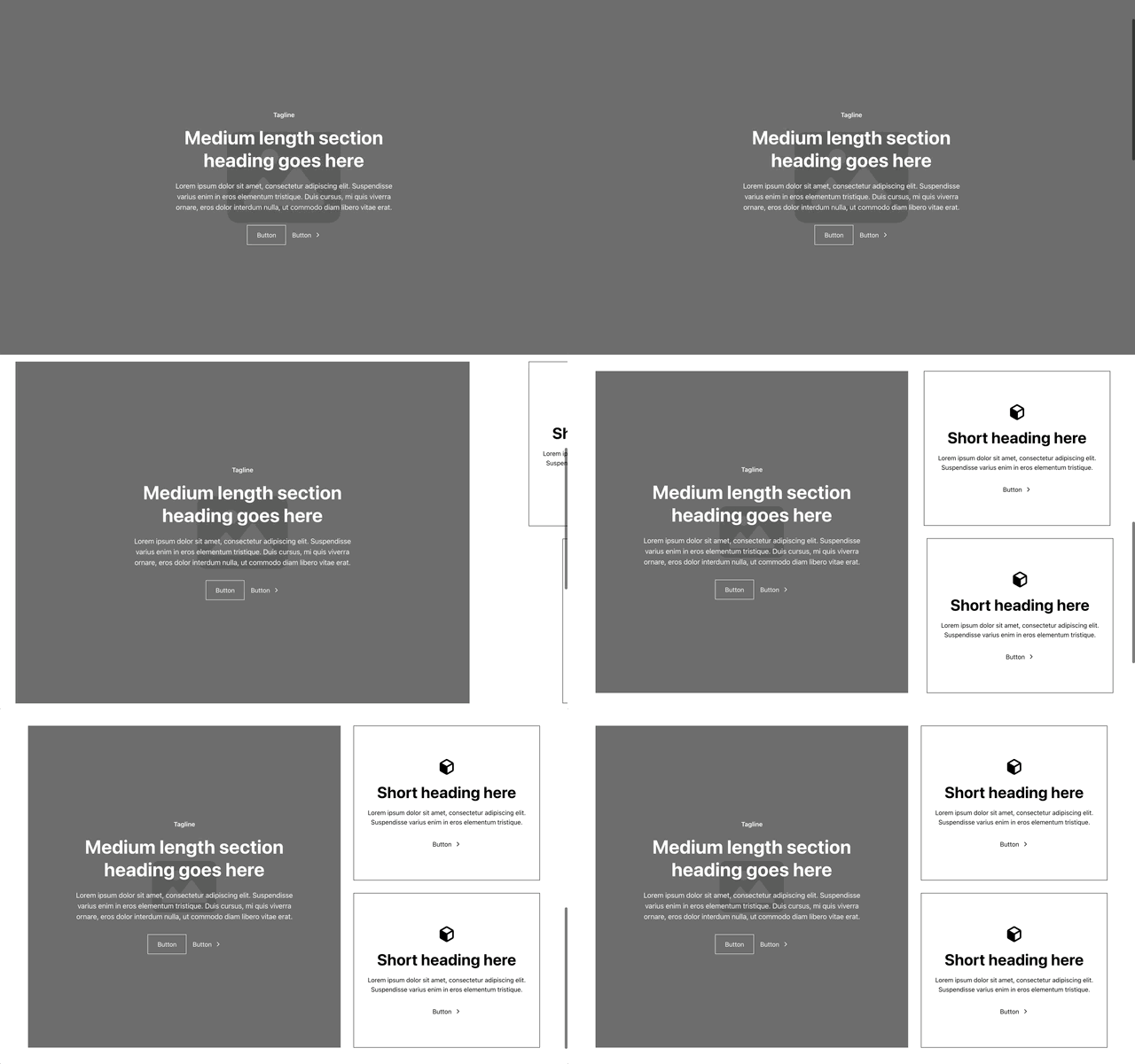
Code
relume-layout518.tsx
"use client";

import React, { useRef } from "react";
import { motion, useScroll, useTransform } from "motion/react";
import { useMediaQuery } from "@/hooks/use-media-query";
import { BackgroundCard, Card } from "@/components/ui/card";
import { Button, type ButtonProps } from "@/components/ui/button";
import { ChevronRight, RelumeIcon } from "relume-icons";

export type ImageProps = {
  src: string;
  alt?: string;
};

export type CardProps = {
  heading: string;
  description: string;
  button: ButtonProps;
};

export type Props = {
  image: ImageProps;
  tagline: string;
  heading: string;
  description: string;
  buttons: ButtonProps[];
  cards: CardProps[];
};

export type Layout518Props = React.ComponentPropsWithoutRef<"section"> & Partial<Props>;

export const Layout518 = (props: Layout518Props) => {
  const { image, tagline, heading, description, buttons, cards } = {
    ...Layout518Defaults,
    ...props,
  };

  const isMobile = useMediaQuery("(max-width: 991px)");
  const containerRef = useRef<HTMLDivElement>(null);
  const { scrollYProgress } = useScroll({
    target: containerRef,
    offset: ["start start", "end end"],
  });

  const heroWidth = useTransform(scrollYProgress, [0, 1], ["100vw", "55vw"]);
  const scaleHeight = useTransform(scrollYProgress, [0, 1], ["100vh", "90vh"]);
  const position = useTransform(scrollYProgress, [0, 1], ["-5%", "0%"]);
  const cardsXPosition = useTransform(scrollYProgress, [0, 1], ["100%", "0%"]);
  const cardsWidth = useTransform(scrollYProgress, [0, 1], ["100vw", "35vw"]);

  const MotionBGCard = motion.create(BackgroundCard) as any;

  const motionHeroStyles = {
    width: heroWidth,
    height: scaleHeight,
    y: position,
    x: position,
  };

  const motionCardsStyles = {
    width: cardsWidth,
    height: scaleHeight,
    y: position,
    x: cardsXPosition,
  };

  if (isMobile) {
    return (
      <section className="relative px-[5%] py-16 md:py-24">
        <div className="relative mb-6 flex items-center justify-center px-6 py-16 md:mb-8 md:px-8 md:py-24">
          <HeroContent
            tagline={tagline}
            heading={heading}
            description={description}
            buttons={buttons}
            image={image}
          />
        </div>
        <div className="grid grid-cols-1 gap-y-6 md:gap-y-8">
          {cards.map((card, index) => (
            <Card key={index} className="flex p-8 text-center">
              <CardContent card={card} />
            </Card>
          ))}
        </div>
      </section>
    );
  }

  return (
    <section ref={containerRef} className="relative py-16 md:py-24 lg:h-[250vh] lg:py-0">
      <div className="mx-auto w-[90vw] lg:sticky lg:top-0 lg:flex lg:h-screen lg:w-full lg:items-center lg:justify-center lg:overflow-hidden">
        <div className="grid grid-cols-1 gap-y-6 md:gap-y-8 lg:h-[90vh] lg:w-[90vw] lg:grid-cols-[55vw_35vw] lg:gap-y-0">
          <MotionBGCard
            style={motionHeroStyles}
            className="relative flex items-center justify-center px-6 py-16 md:px-8 md:py-24 lg:p-3"
          >
            <HeroContent
              tagline={tagline}
              heading={heading}
              description={description}
              buttons={buttons}
              image={image}
            />
          </MotionBGCard>
          <motion.div
            style={motionCardsStyles}
            className="grid grid-cols-1 gap-y-6 md:gap-y-8 lg:pl-8"
          >
            {cards.map((card, index) => (
              <AnimatedCard
                key={index}
                card={card}
                index={index}
                scrollYProgress={scrollYProgress}
              />
            ))}
          </motion.div>
        </div>
      </div>
    </section>
  );
};

const HeroContent = ({
  tagline,
  heading,
  description,
  buttons,
  image,
}: Pick<Props, "tagline" | "heading" | "description" | "buttons" | "image">) => (
  <>
    <div className="relative z-10 max-w-md text-center">
      <p className="mb-3 font-semibold text-white md:mb-4">{tagline}</p>
      <h2 className="mb-5 text-h2 font-bold text-white md:mb-6">{heading}</h2>
      <p className="text-medium text-white">{description}</p>
      <div className="mt-6 flex flex-wrap items-center justify-center gap-4 md:mt-8">
        {buttons.map((button, index) => (
          <Button key={index} {...button}>
            {button.title}
          </Button>
        ))}
      </div>
    </div>
    <div className="absolute inset-0 z-0">
      <img src={image.src} className="size-full object-cover" alt={image.alt} />
      <div className="absolute inset-0 bg-neutral-darkest/50" />
    </div>
  </>
);

const CardContent = ({ card }: { card: CardProps }) => (
  <div className="mx-auto flex max-w-md flex-col items-center justify-center lg:max-w-full">
    <div className="mb-3 md:mb-4">
      <RelumeIcon className="size-12 object-cover text-scheme-text" />
    </div>
    <h3 className="mb-3 text-h3 font-bold md:mb-4">{card.heading}</h3>
    <p>{card.description}</p>
    <Button {...card.button} className="mt-6 md:mt-8">
      {card.button.title}
    </Button>
  </div>
);

const AnimatedCard = ({
  card,
  index,
  scrollYProgress,
}: {
  card: CardProps;
  index: number;
  scrollYProgress: any;
}) => {
  const x = useTransform(
    scrollYProgress,
    [0, index * 0.01, 0.2 + index * 0.5, 1],
    ["100%", "100%", "0%", "0%"],
  );

  const MotionCard = motion.create(Card) as any;

  return (
    <MotionCard style={{ x }} className="flex p-8 text-center lg:max-w-[640px]">
      <CardContent card={card} />
    </MotionCard>
  );
};

export const Layout518Defaults: Props = {
  image: {
    src: "https://d22po4pjz3o32e.cloudfront.net/placeholder-image.svg",
    alt: "Relume placeholder background image",
  },
  tagline: "Tagline",
  heading: "Medium length section heading goes here",
  description:
    "Lorem ipsum dolor sit amet, consectetur adipiscing elit. Suspendisse varius enim in eros elementum tristique. Duis cursus, mi quis viverra ornare, eros dolor interdum nulla, ut commodo diam libero vitae erat.",
  buttons: [
    { title: "Button", variant: "secondary-alt" },
    {
      title: "Button",
      variant: "link-alt",
      size: "link",
      iconRight: <ChevronRight className="text-white" />,
    },
  ],
  cards: [
    {
      heading: "Short heading here",
      description:
        "Lorem ipsum dolor sit amet, consectetur adipiscing elit. Suspendisse varius enim in eros elementum tristique.",
      button: {
        title: "Button",
        variant: "link",
        size: "link",
        iconRight: <ChevronRight className="text-white" />,
      },
    },
    {
      heading: "Short heading here",
      description:
        "Lorem ipsum dolor sit amet, consectetur adipiscing elit. Suspendisse varius enim in eros elementum tristique.",
      button: {
        title: "Button",
        variant: "link",
        size: "link",
        iconRight: <ChevronRight className="text-white" />,
      },
    },
  ],
};
npm i @radix-ui/react-dialog @radix-ui/react-slot @radix-ui/react-tabs class-variance-authority@0.7.1 clsx@^2.1.1 motion@^12.15.0 relume-icons@1.3.0 tailwind-merge@^2.2.2